
How to Build a Customer Retention Dashboard That Works
Short answer: A customer retention dashboard is a visual tool that tracks key metrics like churn rate, retention rate, customer lifetime value, and repeat purchase rate. Build one by defining your goals, selecting 3-5 core metrics, connecting your data sources, and designing a clean layout that highlights trends and alerts. Update it weekly and share it with your team to foster a retention-focused culture.
Key takeaways
- Focus on 3-5 core metrics, not every available data point.
- Cohort analysis reveals which customer groups stay or leave.
- Include leading indicators like product usage or support tickets.
- Automate data collection to keep the dashboard live and accurate.
- Segment dashboard views for different teams (e.g. support, sales).
- Review and refine metrics quarterly as your business evolves.
What you will find here
- Why a Customer Retention Dashboard Matters
- Core Metrics to Include in Your Customer Retention Dashboard
- Step-by-Step: Building Your Dashboard
- Common Mistakes to Avoid
- Using the Dashboard to Drive Action
- Example Dashboard Structure
- Getting Started Today
- How to Choose the Right Metrics for Your Business
- Common Data Integration Challenges and How to Overcome Them
- Turning Dashboard Insights into Automated Workflows
A customer retention dashboard gives you a clear picture of who stays, who leaves, and why. Without one, you are flying blind when it comes to churn. You might notice revenue dipping but not know whether it is a few big accounts leaving or a slow bleed across your whole customer base. A well-designed dashboard turns vague worries into concrete numbers you can act on.
In this guide, you will learn what to track, how to design the dashboard, and how to put it to work so it actually reduces churn. We will skip the fluff and focus on what works.

Why a Customer Retention Dashboard Matters
Customer acquisition gets most of the attention, but retention drives long-term profitability. A small improvement in retention can increase profits significantly, depending on your industry. A dashboard keeps retention top of mind.
It also helps you move from reactive to proactive. Instead of waiting for customers to cancel, you see warning signs early. Maybe usage drops, support tickets spike, or the customer stops logging in. Your dashboard alerts you so you can intervene before they leave.
Core Metrics to Include in Your Customer Retention Dashboard
Pick your metrics carefully. Too many will clutter the view and dilute focus. Start with these five.
1. Retention Rate
This is the percentage of customers who continue buying over a given period. Calculate it as (Number of customers at end of period – New customers acquired) / Number of customers at start of period. Track it monthly, quarterly, and annually.
2. Churn Rate
The flip side of retention. Churn rate = Customers lost in period / Customers at start. A high churn rate means you have a problem. Break it down by customer segment to see if churn is higher among new users, small accounts, or specific industries.
3. Customer Lifetime Value (LTV)
LTV tells you the average revenue you can expect from one customer over the entire relationship. Compare LTV to customer acquisition cost (CAC). If LTV is less than three times CAC, you are spending too much to acquire customers who leave too soon.
4. Repeat Purchase Rate
For product-based businesses, this measures how many customers come back for another purchase. For subscription businesses, it is closely related to retention. Track it by cohort to see if newer customers behave differently from older ones.
5. Customer Health Score
This is a composite score based on factors like product usage, support interactions, account growth, and feedback. It gives a single number that tells you how ‘at risk’ a customer is. Many SaaS companies build health scores into their personalization and automation strategies to trigger timely interventions.
Step-by-Step: Building Your Dashboard
Follow these steps to create a dashboard that is easy to maintain and actually used by your team.
Step 1: Define Your Goal
What do you want the dashboard to achieve? Common goals include reducing churn, improving LTV, or increasing repeat purchases. Your goal determines which metrics matter most.
Step 2: Choose Your Data Sources
Your dashboard will pull data from your CRM, billing system, product analytics tool, and customer support platform. Map out which fields contain the data you need. For example, subscription start and end dates from billing, login frequency from product analytics, and support ticket count from your help desk.
Step 3: Select the Right Dashboard Tool
Options range from simple spreadsheets to sophisticated BI platforms. If you are a small business, Google Data Studio or Microsoft Power BI offer free tiers. For larger teams, consider Tableau or a dedicated customer analytics platform like Totango or Gainsight. Choose something your team can actually learn and maintain.
Step 4: Design the Layout
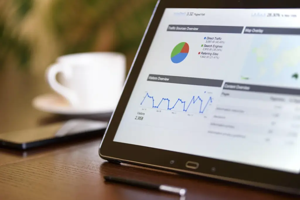
Keep it simple. Put the most important metric (retention rate or churn rate) at the top left. Use a KPI card for each key metric. Below, add trend lines for the last 12 months. On the right side, include a cohort table. At the bottom, list recent alerts or accounts with low health scores.
Use color sparingly. Green for good, yellow for warning, red for danger. Avoid busy charts. A line chart for trends and a bar chart for cohort comparisons are usually enough.
Step 5: Populate with Data and Set Alerts
Automate data refresh if possible. Manual updates get stale quickly. Set threshold alerts. For example, if churn rate exceeds a certain level in a month, send an email to the team. If a customer’s health score drops below a threshold, assign a task to the account manager.
Step 6: Test and Iterate
Show the first version to a few team members. Ask if they understand it and if it helps them make decisions. You will likely need to add or remove metrics. Plan to revisit the dashboard design every quarter.
Common Mistakes to Avoid
Building a dashboard is easy. Building one that people use is harder. Watch out for these pitfalls.
Too many metrics. Stick to five or fewer. More than that, and people’s eyes glaze over. They will ignore the dashboard altogether.
Vanity metrics. Total registered users looks impressive but says nothing about retention. Focus on active users and paying customers.
No context. A number like a high retention rate is meaningless without context. Compare it to last month, last quarter, or industry benchmarks.
Stale data. If your dashboard updates only monthly, you will miss real-time churn signals. Aim for daily or weekly updates.
Using the Dashboard to Drive Action
Data alone changes nothing. You need a process. Schedule a weekly 15-minute review of the dashboard with your team. Look for changes since last week. Discuss why churn might be up in a particular segment. Assign someone to follow up on red-flagged accounts.
Link dashboard insights to specific retention strategies. If you see a cohort of users dropping after the trial, revisit your onboarding flow for SaaS startups. If local service businesses show high churn among one-time customers, check our retention checklist for local services for ideas.
As you act on what the dashboard tells you, your retention will improve. And when it does, you will have the data to prove it.
Example Dashboard Structure
| Section | Content | Update Frequency |
|---|---|---|
| Top KPI Row | Retention Rate, Churn Rate, LTV, Repeat Purchase Rate, Health Score | Daily |
| Trend Chart | Retention and churn over last 12 months | Monthly |
| Cohort Table | Retention by monthly cohort for last 6 months | Monthly |
| Alert Section | Accounts with health score under threshold, spiking support tickets, or dropped usage | Real-time |
| Segment Breakdown | Churn by plan, industry, or acquisition channel | Weekly |
Getting Started Today
You do not need a fancy tool or a data team. Start with a Google Sheets dashboard. List your key metrics, gather the data from your systems, and update it weekly. As you see patterns, refine your approach.
Your customer retention dashboard will become the central place your team goes to understand the health of your business. It turns guesswork into facts. And facts lead to better decisions that keep customers around longer.
How to Choose the Right Metrics for Your Business
Not every metric fits every business. A SaaS company might obsess over daily active users, while a local service business cares more about repeat booking rate. Start by identifying the key actions that signal a healthy customer relationship. For a subscription box service, that might be unboxing videos shared on social media. For a B2B software provider, it could be the number of integrations configured.
Once you identify those actions, decide which are leading indicators (predict future retention) and which are lagging (confirm past retention). Leading indicators deserve dashboard space because they let you act early. For example, if a customer stops using a key feature, that is a leading indicator of churn. A canceled subscription is a lagging indicator.
Test your chosen metrics against a simple question: “If this number goes up, will retention likely improve?” If the answer is unclear, replace it with something more direct.
Common Data Integration Challenges and How to Overcome Them
Pulling data from multiple systems often runs into problems. Your CRM might store customer start dates differently than your billing system. Product analytics might use a different user ID than your support platform. These mismatches produce unreliable numbers.
To fix this, standardize your customer identifiers. Use a single customer ID across all systems. If that is not possible, create a mapping table that links IDs. For example, your CRM’s contact ID maps to your billing system’s account number. Your dashboard tool can then join datasets on that mapping.
Another frequent issue is data freshness. Billing systems update in real time, but product usage data might lag by a day. Decide on a consistent cutoff time for each data source, and note it on the dashboard. That way, everyone knows the data reflects status as of a certain moment.
When data is missing, do not fill in zeros or averages. Instead, flag the data point as incomplete. A missing value is better than a misleading one. Your team can then investigate the root cause.
Turning Dashboard Insights into Automated Workflows
Once your dashboard is live, connect it to actions that run automatically. Many BI tools and CRM platforms support integrations with email, Slack, or task management systems. For example, if a customer’s health score drops below a threshold, trigger an email to the customer success team with account details. Or send a Slack message to the support manager when a high-value account opens more than three tickets in a week.
Automation ensures the dashboard drives action even when no one is looking at it. But be careful not to overload your team with alerts. Start with two or three triggers that focus on your highest-risk accounts. Tune the thresholds over time to reduce false positives.
Also consider automated interventions for the customer. If usage drops, send a re-engagement email with tips or a tutorial. If the customer has not logged in for seven days, offer a free consultation call. These small touches can prevent churn before anyone on your team even sees the alert.
Frequently asked questions
What is the number one metric to track on a customer retention dashboard?
Churn rate is the most critical metric because it directly measures customer loss. However, pair it with retention rate to get a complete picture. If you track only one, track churn rate by cohort to see which groups are leaving.
How often should I update my customer retention dashboard?
Aim for daily or weekly updates for leading indicators like product usage and support tickets. Cohort metrics like retention rate can be updated monthly. Real-time updates are ideal for health scores and alerts.
Can I build a retention dashboard using only spreadsheets?
Yes, spreadsheets work well for small businesses or early-stage startups. Tools like Google Sheets or Excel can track key metrics if you manually input data. As you grow, consider BI tools that automate data collection.
What is a customer health score and how is it calculated?
A customer health score is a composite measure that predicts churn risk. It typically includes product usage frequency, support ticket volume, account growth, and survey feedback. Assign weights to each factor and normalize them to a 0-100 scale.
How do I choose the right metrics for my dashboard?
Start with your business goal. If you want to reduce churn, track churn rate, retention rate, and health score. If you want to increase LTV, add average revenue per user and upsell rate. Limit to 3-5 metrics to keep the dashboard clear.






One Comment